12 Autocomplete Suggestion Design Best Practices
Poor autocomplete design can prevent customers from making purchases. These 12 best practices will create a smooth user experience and increase conversions.

Poor autocomplete design can prevent customers from making purchases. These 12 best practices will create a smooth user experience and increase conversions.
Autocomplete search is so ubiquitous on retail sites that it would be odd not to see it. However not all site search boxes are created equal.
Baymard Institute, independent researchers on web usability, found that more than a quarter of sites have autocomplete design problems that cause usability issues. From the number of suggestions provided to the typography used in the suggestions list, autocomplete design can go wrong in many ways.
That’s the bad news. The good news is that you don’t have to start from scratch designing a search autocomplete experience that makes it easier and faster for users to find what they want — and purchase it from your site.
Baymard’s research has identified the design elements that consistently create a smooth user experience. Below, we’ll show you some of those elements in action.
1. Set autocomplete off from the rest of your site.
To keep searchers on your site from becoming overwhelmed, use a border or shadow around the autocomplete box. This helps the rest of the site fade into the background so that users can focus on their searches. You may even want to darken the rest of a desktop site when the search box is used.
BAD VS. GOOD
2. Minimize mobile distractions.
On the mobile screen, autocomplete gets less room, which makes distraction even more damaging to the user experience. Ensure that elements such as ads, chat icons, and navigation aren’t crowding your mobile autocomplete and making it unusable.
BAD VS. GOOD
![]() .
. 
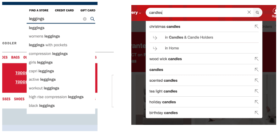
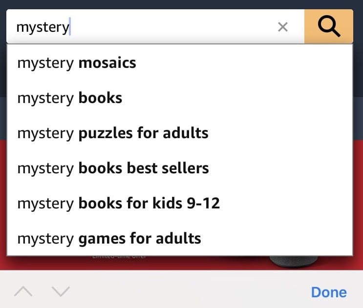
3. Desktop: Limit autocomplete suggestions to 10
When it comes to autocomplete suggestions, presenting more options isn’t necessarily a better search. It’s just confusing. Displaying 10 suggestions is the sweet spot for expediting a user’s website search. Showing more than 10 autocomplete suggestions (even if scrolling is required to see some) overwhelms searchers, who have trouble choosing among them.
BAD VS. GOOD
 .
. 
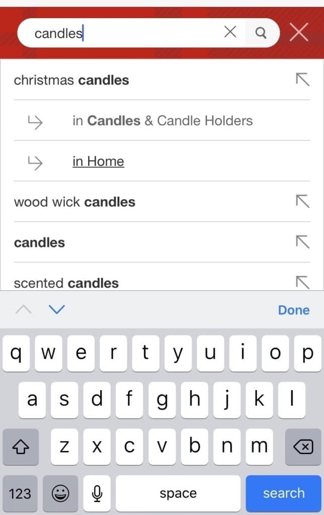
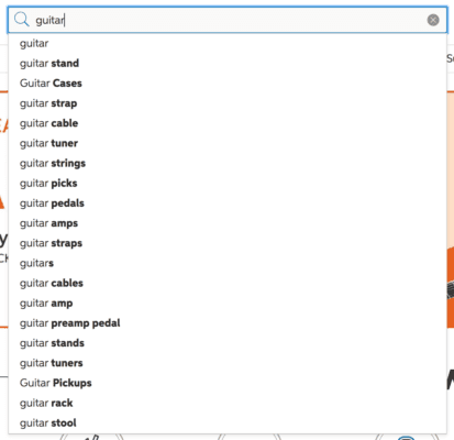
4. Mobile: Limit autocomplete suggestions to 4-8.
Since mobile screens are smaller than desktop ones, your list of suggestions should also be smaller. Some sites use scrolling to give mobile users access to more suggestions, but this isn’t usually a good idea. Most searchers will choose from among the first three suggestions.
BAD VS. GOOD
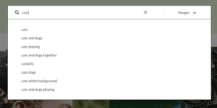
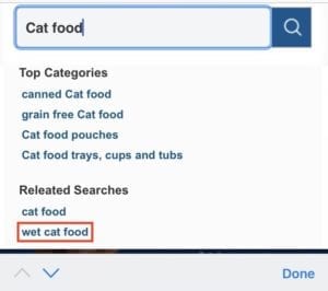
5. Clearly indicate that scrolling is possible
If you do need to use scrolling with search autocomplete on mobile, it should be a clear option for users. Partially obscuring the last suggestion is one way to accomplish this.
In the list of search suggestions for “cat food,” scrolling is possible, but that’s not evident. (The downward-pointing arrow takes users to a different field on the site.)
BAD VS. GOOD
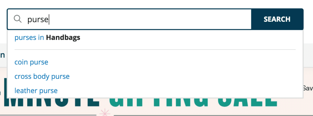
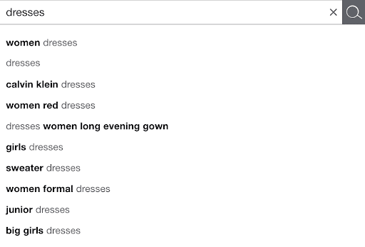
6. Make scope suggestions stand out
Giving visitors the option of seeing results for their website search terms within a particular category is one of the most user-friendly things you can do with your site search box. In this example, the first suggestion is to view purses within the Handbags category. These scope suggestions are most helpful when they stand out typographically from the rest of the list. In this example, “Handbags” is in bold type.
BAD VS. GOOD
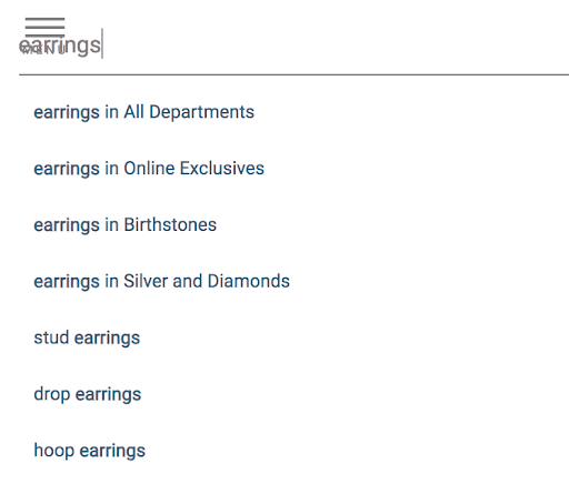
7. Use labels within the suggestion list
Similarly, dividing your site search results into different sections — suggestions, product categories, and brands is helpful. This helps users more quickly get a sense of their options.
BAD VS. GOOD

8. Keep the display of suggestions simple.
Don’t go crazy with design elements in your autocomplete suggestions. A minimal approach is usually enough to help users scan and quickly comprehend the list. When used to excess, things like padding, separators, alternating row colors, and even product images start to feel like distractions.
BAD VS. GOOD
9. Design mobile suggestions to be readable.
Autocomplete suggestions on mobile require even more care to design. The font size must be big enough to read quickly, and spacing should promote legibility. Lowercase or title-case suggestions are easier to read than those in all caps.
BAD VS. GOOD
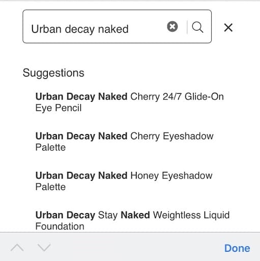
10. Wrap text in mobile suggestions.
Have you ever searched for a product on a mobile site only to discover that all the suggestions were truncated and, therefore, impossible to choose from? The solution here is to use text wrapping. In this example, the various results for Urban Decay products expand to two lines so that the full name of each product is clear. On a less well-designed site, the first result (for example) might have been displayed as “Urban Decay Naked…Pencil.”
BAD VS. GOOD EXAMPLE

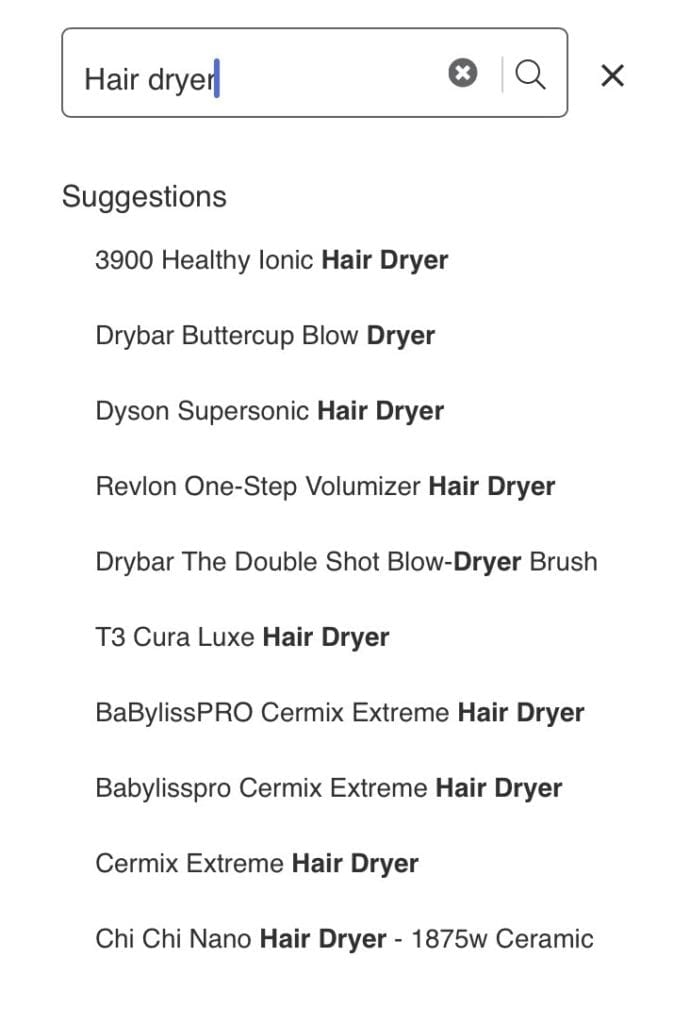
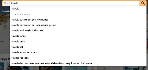
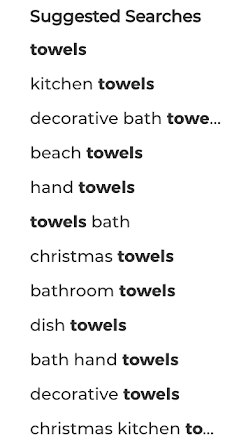
11. Highlight the predictive search part of suggestions.
Autocomplete search suggestions contain two parts:
- The term the user searches for. In our screenshot, that’s “towels.”
- The predictive search text completes the suggestions. Returning to the screenshot, examples of predictive search text include “towels set” and “towels for kids.”
On some websites, the original search term and the predictive part of suggestions are styled identically. That makes it harder for users to quickly process the suggestions and identify the ones relevant to them. It also is not helpful to highlight the search term (for example, by putting it in bold text) since it repeats in every suggestion.
Instead, highlight what’s different with each suggestion. This creates an easily scannable list and speeds up users’ searches.
BAD VS. GOOD EXAMPLE
12. Show users that their selections are active.
So let’s say a desktop user is now hovering their mouse over the autocomplete suggestions or navigating them with keyboard arrows. They pause on a suggestion that looks promising. At this point, the user must get visual feedback that their suggestion is active. This feedback should be more precise than simply turning the arrow into a hand icon when they hover over a particular suggestion. For example, the background behind the item they’re hovering over could become shaded.
To help keyboard users complete their site search faster on desktop, you can copy the selection they highlight to the search field. They can then add pertinent details to the selected term before submitting it.
BAD VS. GOOD EXAMPLE
Simply having autocomplete on your site isn’t enough to drive conversions. Using these best practices will encourage customers to stay on your site — unlike the almost 25 percent of visitors who abandon a site after trying the site search box. And it will help them narrow their options and discover the items they want to purchase. In other words, improving the customer experience improves the bottom line.
LEARN MORE
Contact us today to learn how Lucidworks can help your team create powerful search and discovery applications for your customers and employees.