New Fusion Look, Who Dis?
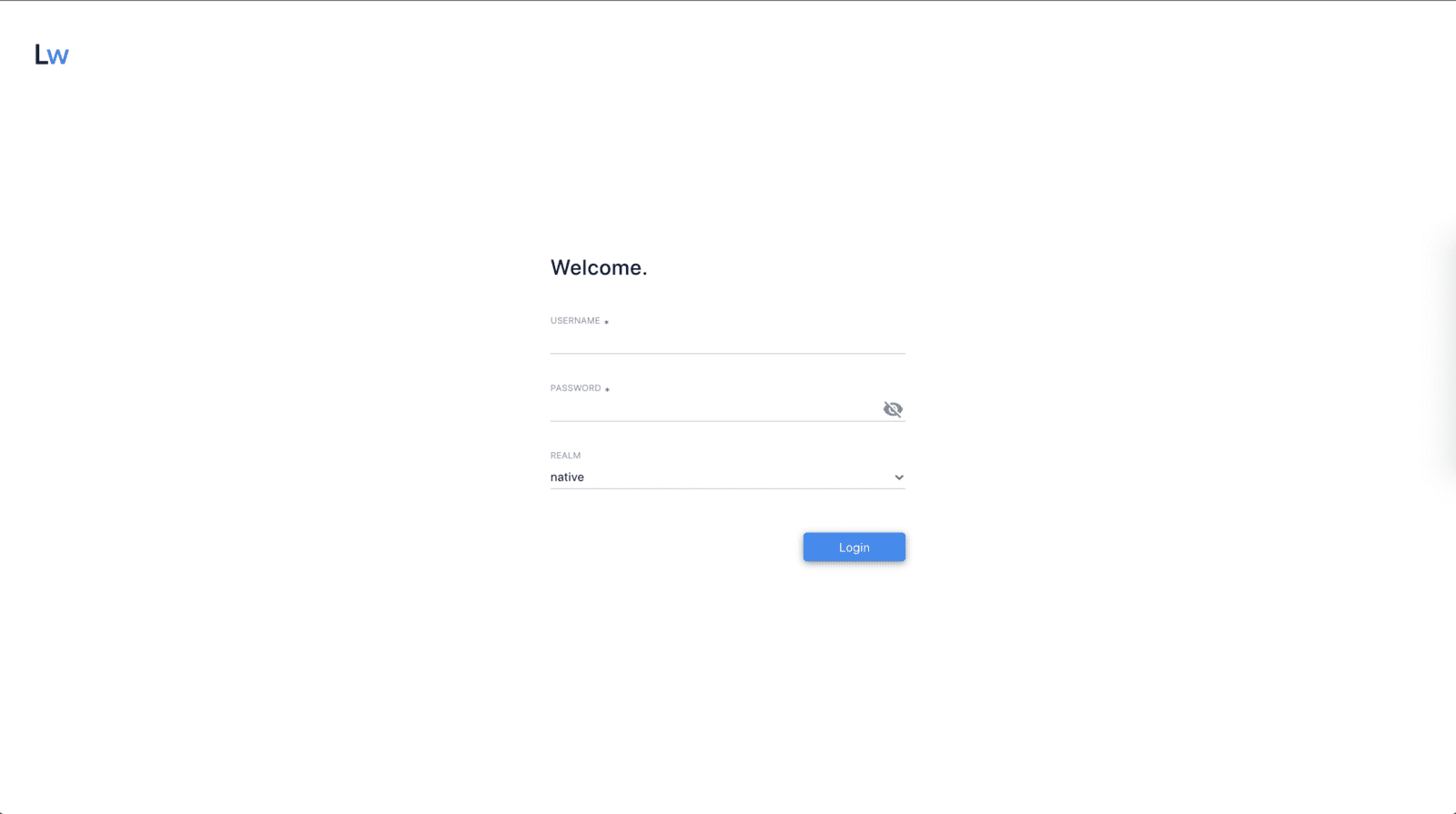
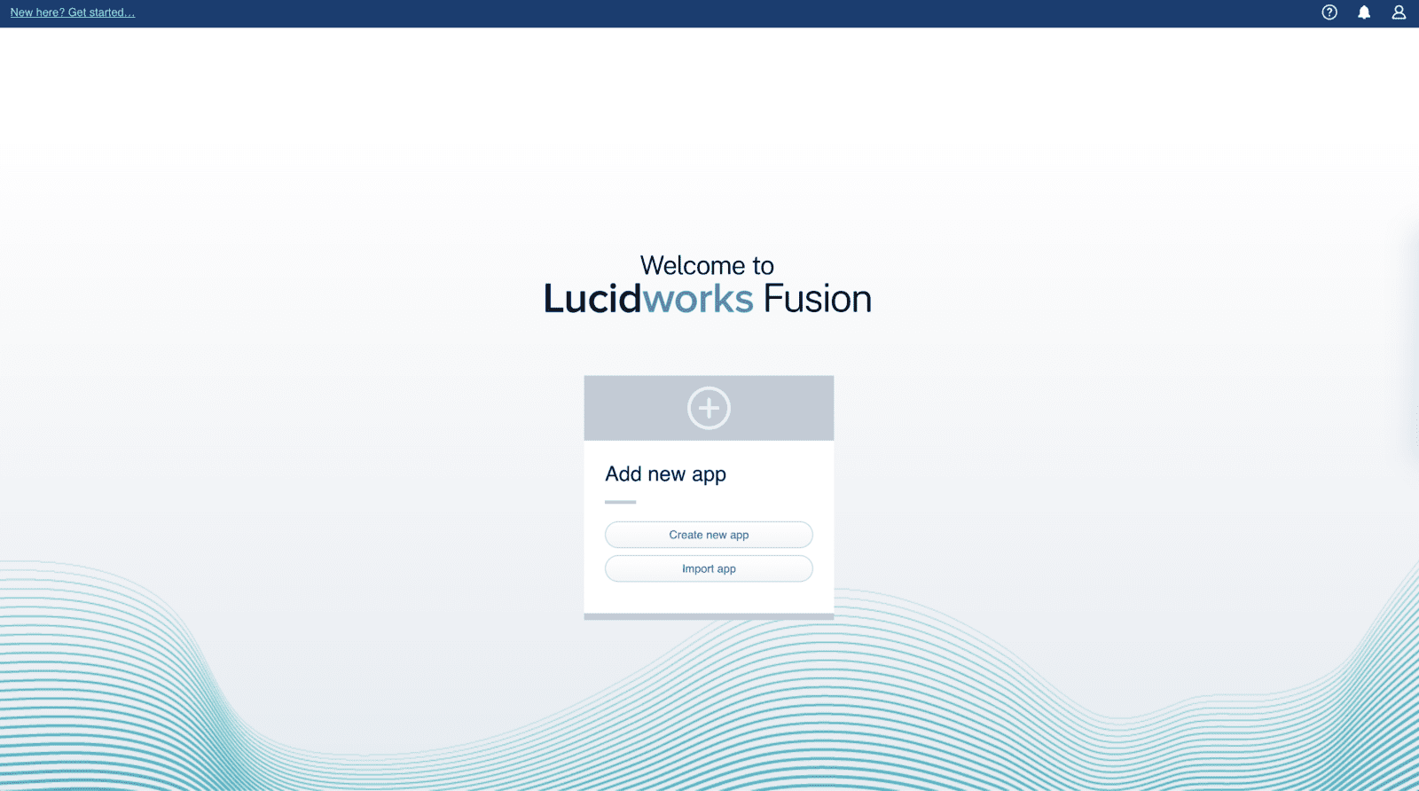
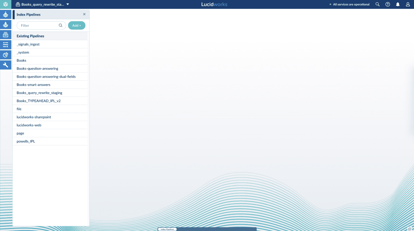
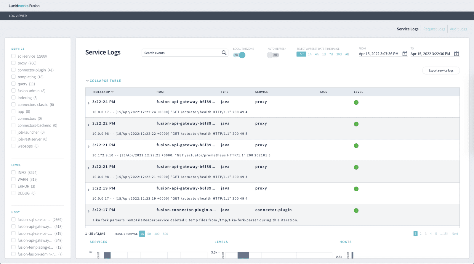
We've updated our Fusion branding to better align with our vision and message at Lucidworks. This is what's new.

Back in September of 2021, Lucidworks launched our dynamic new branding. The intention was to create an emotional connection to our customers and their end-users, showcasing how our products allow them to create delightful experiences in the moment. Our search products connect insights across organizations and use the most powerful data at their disposal – search data – to drive business outcomes and exceed revenue goals. We wanted the branding to reflect an optimistic and colorful outlook for the future of on-site experiences – for both the commerce and workplace verticals.
In February of this year, we began the process of supercharging our innovation for our Fusion platform and we wanted to create a visual cue that signaled that innovation to our Fusion users. We’re proud of our UX design within the Fusion platform, but we knew that the UI needed to reflect our new strategic vision for the future. Because we chose bold colors to reflect our bright outlook, we had to ensure the new Fusion UI colors were strategically applied and mirrored the new Lucidworks brand.

Our Creative Director, Rachel Wescott, made sure that this complicated area of visual design was thoughtful and impactful. “We’re continually taking steps to unify the Lucidworks visual design experience now that the new brand has debuted. Visual design plays an important role in brand perception and helps customers feel good about the purchasing decision they’ve made. Expanding the look and feel of the established visual voice and tying our product into a cohesive system builds trust. Especially when it’s expressed throughout the entire ecosystem of a company from the corporate brand down to the product level. It’s a subtle thing – every touchpoint provides an opportunity to make an impression on your customers. Having consistency in that journey brings a feeling of ‘rightness’. Where conversely, a disjointed experience feels unpolished. Your users won’t exactly be able to put their finger on why an experience is jarring but our brains intuit that discord and can leave your users with an unsettled feeling. Or even worse, they feel lost while navigating your site or software. Maintaining visual cohesion helps pull though that thread of connection. Top of funnel is your brand’s first impression, but brands build trustworthiness in a customer’s mind by maintaining the system from engagement through post-sale adoption.”
The whitespace was, of course, also key, and we wanted to consider shading and spacing while we kept the color in mind. We wanted to ensure that the intuitive nature of the UX was reflected in the palette and that the palette was able to shine in places that guided our Fusion users to the right features and locations within the UX.

Why? Because a revamped version of a familiar interaction or interface adds “cognitive load”: it makes people think again about a process they’ve already learned. Obviously, you can reinvent the wheel all you want—but only if it actually improves the user’s experience. Our brains are “cached”, for lack of a better word, and when we’re asked to load new changes, it disrupts how quickly we accomplish tasks and it even creates mental hardship to adapt to the change, which causes unhappiness. This is why being extra thoughtful with our UI experience design is paramount.

Since our first touch with the market is so focused on creating delightful and personal experiences, our product UX needs to subtly align itself to that Lucidworks credo. Our customers and their end-users should be influenced, however gently, by what challenges our products aim to solve and with the grace with which we aim to solve them. Data and insights aren’t often spoken of in elegant terms, and the structured and unstructured data that sits behind every search bar wouldn’t necessarily be called graceful, but in a world where we’re continuously improving on how we action on the information our websites provide, those are the kinds of cultural shifts we aim to move forward.

As we build towards that future, we’re excited to move Fusion forward with us. The platform’s new look is representative of our vision of creating meaningful experiences in the moment–starting with how our customers interact with our product. If you’d like to learn more about what Fusion can bring to your brand’s digital experience, please get in touch.
LEARN MORE
Contact us today to learn how Lucidworks can help your team create powerful search and discovery applications for your customers and employees.